
NIDO: BRANDING, logotype and graphic Identity
NIDO

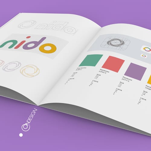
The creation of the brand name, logo, and graphic identity
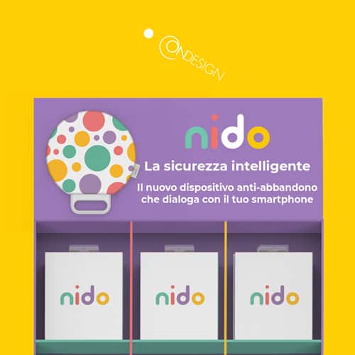
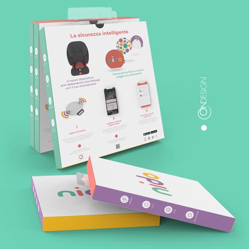
ONdesign has developed a comprehensive branding strategy for NIDO that emphasizes the idea of intelligent safety for children. This includes not only the creation of the brand name and graphic identity but also a consistent approach to product design, packaging, user experience (UX), and app user interface (UI).
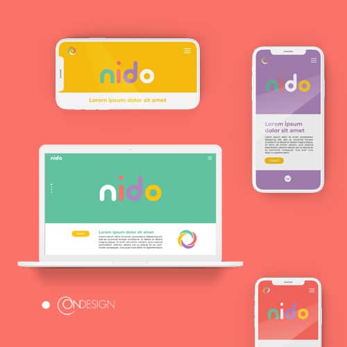
The brand name and graphic identity, including the logo and communication materials, serve to establish the tone and reinforce the image and values of the company. These elements must work together to create a coherent and recognizable brand for NIDO.
The term “NIDO” was chosen by ONdesign to represent the concept of intelligent safety for children. The semantic meaning of “nido” (nest in English) refers to a protected and welcoming place where children can feel safe and secure. Additionally, the word “NIDO” also evokes the idea of care and protection associated with the image of parents building a nest for their young. This emotional appeal contributes to amplifying the effect of safety and protection that the brand wants to convey to its customers.
The font chosen for the NIDO branding is round and welcoming, in order to convey a sense of familiarity and closeness to children and their families. Moreover, the adopted colors are bright and complementary, capable of evoking a sense of serenity and joy. This mix of colors and fonts, combined with the semantic meanings of NIDO, represents an important branding strategy to create a distinctive and recognizable image for the NIDO brand, based on the perception of intelligent safety for children and their families.
Overall, the brand name and graphic identity created by ONdesign for the NIDO brand play a crucial role in the company’s overall image and communication strategy. By ensuring consistency and coherence in all elements of the brand, NIDO is able to reinforce its image and values and connect with its target audience.